TL;DR
This project was given to me as a final project to work on during my internship on the Mastercard Click to Pay design team.
I was asked to come up with design iterations that would be going to testing the following week for a business problem we noticed from our previous research and studies. I didn’t have much time to do a lot of research on my own, so with all the facts I was presented with and the business problem, I went into Sketch and came up with a couple of design iterations that I believed could possibly solve the problems at hand. My work was reviewed by a Design Manager and after each iteration she gave me feedback to implement on my next try, and on one of the iterations I sent her, she loved it and immediately told the Click to Pay Design team “Favour’s work on the Learn More modal has great potential of going live in market. I can’t wait for you guys to see what she worked on! “
This was the last project I worked on and hearing this feedback was a full circle moment for me after spending 10 weeks on the Click to Pay Design Team. This was the perfect way for me to end my internship, it was my “take a bow“ moment (like in the movies).
Learn More Modal Product Description
The “Learn More modal” is a product education moment for users to discover and learn more about Click to Pay, how it works, its value prop, and its benefit for users.
Project Overview
The Timeline was two days (the project was given to me a day before the end of my internship).
My role was the Sole Product Designer.
The Deliverables were Sketch Screens.
Business Problem
The existing modal had challenges with its visual design, content messaging, and readability factor.
From testing, we found that users click the logo lockup on the Click to Pay screen quite often and our hypothesis is that they were expecting to be taken to a place where more information about this experience could be found.
Project Goal
My major goal was to come up with designs that solve the business problem.
Apart from designing a solve, I also wanted to inspire the Click to Pay Design team to implement the new concepts I was introducing for the Learn More product modal.
Existing Modal

Pain Points
Size of text container: The size of the text container does not make it easy for a user to scan this content. Specifically, the intro statement under What is Click to Pay? That text box is quite narrow and breaks up the viewing and scanning experience to easily digest the content.
Iconography: we like the use of icons as "bullets" however, they are all different sizes and do not correlate with the text in the bullets.
Aesthetics: The design is lacking in aesthetics and visual design attraction.
Problem Statements
How Might We make the modal easily scannable for Click to Pay users?
How Might We make use of a different style of icons to streamline visually?
How Might We make this modal more interesting?
How Might we use Click to Pay brand colors in a useful way?
Design….

1st Design Iterations
Introduced an onboarding approach to make it easier for users to scan and swipe through screens.
Included a value prop statement that relates to the icon and the call to action message.
Implemented content messaging that increases product comprehension and ultimately influences users to enroll their card for Click to Pay.
Made use of some secondary colors that are in the Click to Pay product experience.

2nd Design Iterations
Kept onboarding approach from the first iterations to make it easier for users to scan and swipe through screens.
Implemented the value prop statement as the only content messaging in the text container to make scanning through the content on each screen easier and quicker.
Changed the cart icon to match the rest of the icons for consistency purposes.
Kept the same color scheme from first iterations.

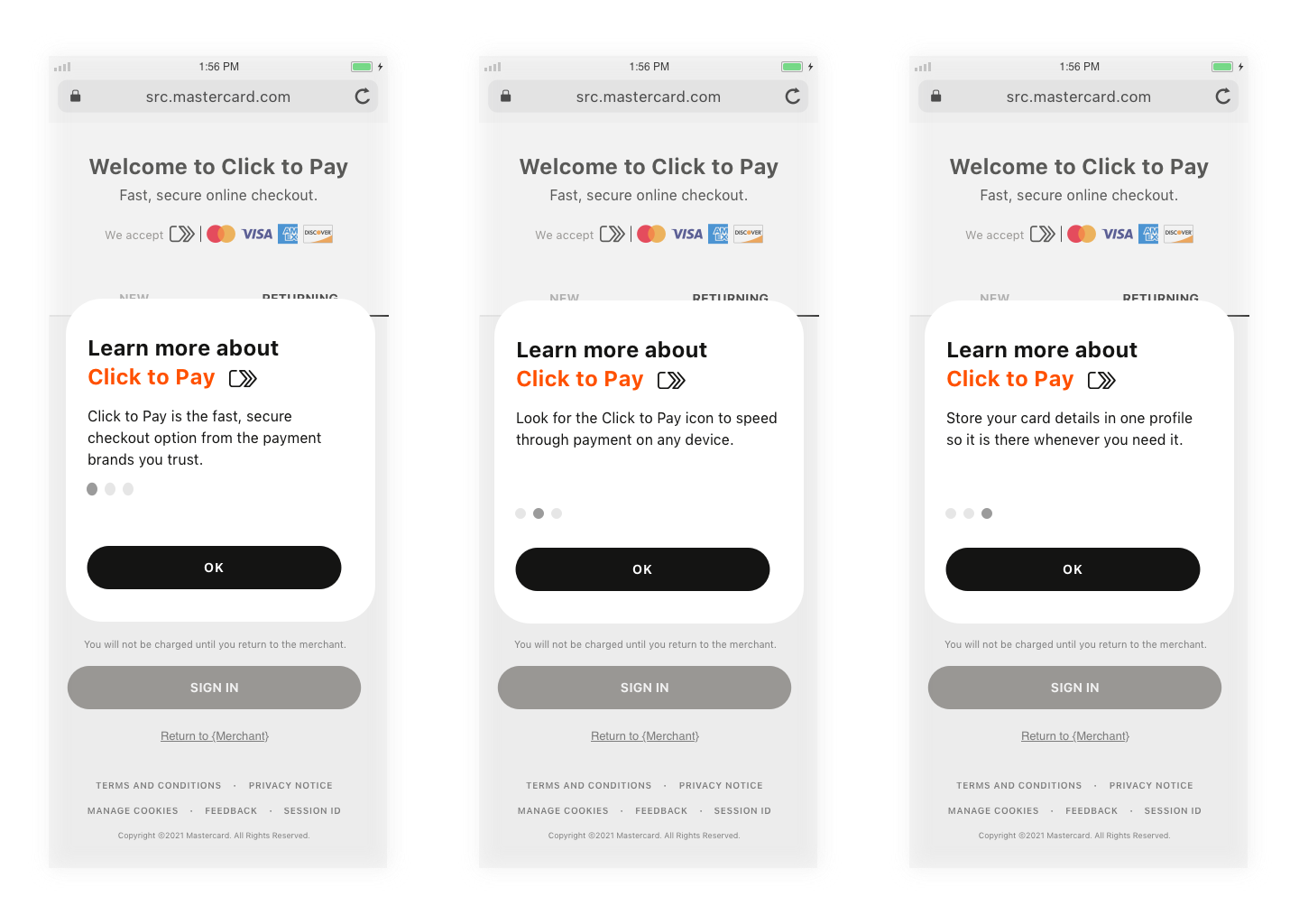
3rd and Final Design Iterations That Went to Testing
Made use of the primary Click to Pay brand colors that users are familiar with to increase brand awareness and product education.
Used the Click to Pay icon in the header to keep a consistent use of the brand icon throughout the “Learn More” experience. And also to not confuse users with different icons.
Kept onboarding approach from the first and second iterations to make it easier for users to scan and swipe through screens.
Implemented the value prop statement as the only content messaging in the text container to make scanning through the content on each screen easier and quicker.
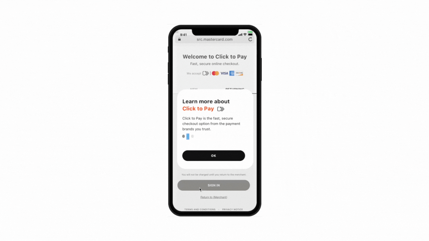
Product Demo of Learn More modal
The background of the screen is blurred out a bit to make the modal the main focus on the screen.
The modal appears as an overlay on the screen so that the users can continue with what they were doing before clicking on the modal.
Highlights Of The Project
From testing we discovered that the value prop content ultimately influences users to enroll their card for Click to Pay.
The project is currently in production and will be going live in market soon.
A major lesson I learned from this project was how to fail fast as a designer. I was only given two days to come up with ideas on how to solve the problems we were facing with this modal, and with all the information I had about the problem and the product, I was able to make smart assumptions and come up with different iterations I believed could possibly solve the design and business problems.
This is how the Learn More modal would appear when a user clicks on “Learn More“ from the Sign In screen.

This is how the Learn More modal would appear on a Click to Pay merchant’s contact info screen.